Memo
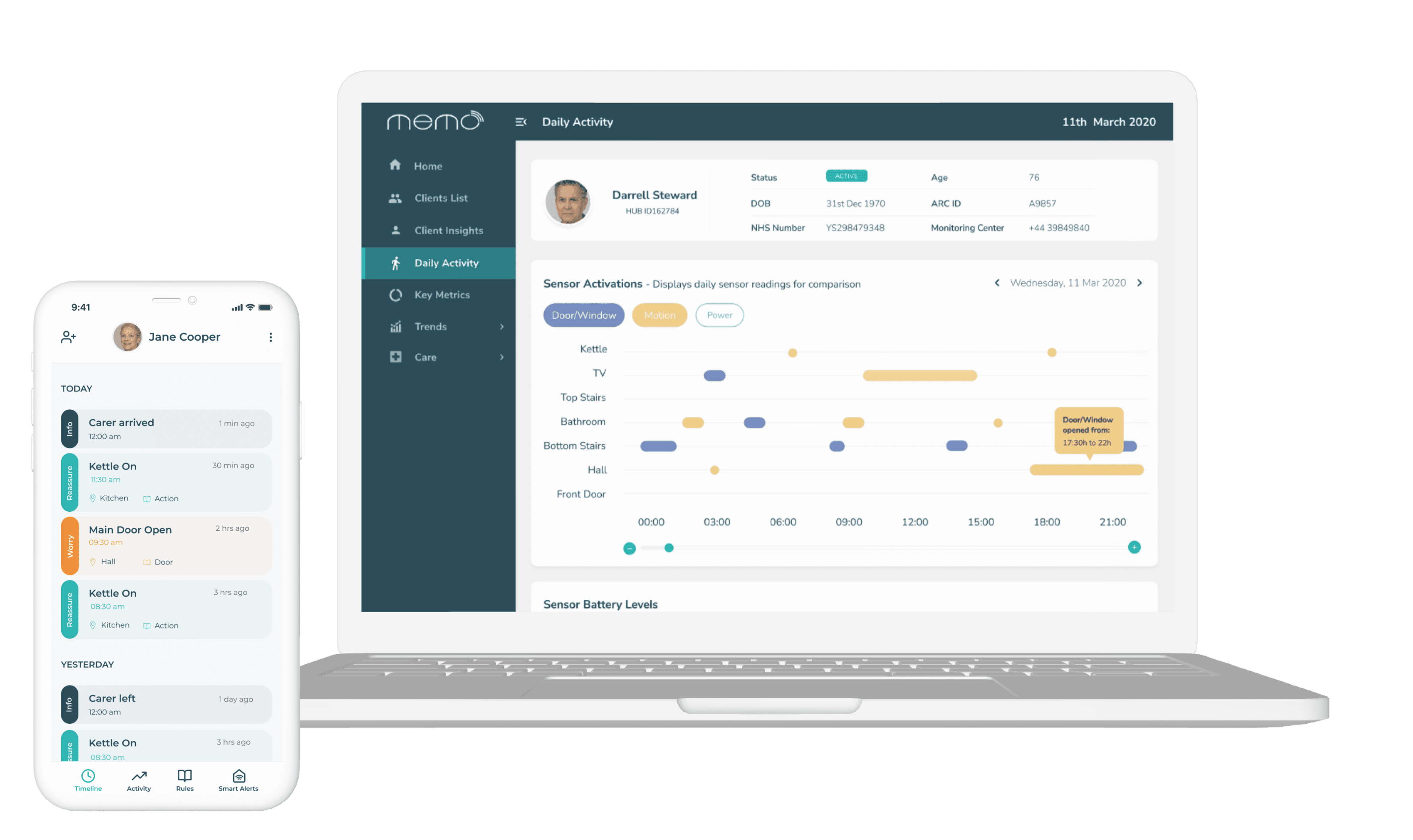
Mobile app and dashboard used to monitorize vulnerable and older individuals by families and carers
ROLE
Solo Product Designer
- Research & Analysis
- Design & Branding
- Usability Testing
Alcuris is a health-care startup that provides a combination of hardware and an in-home digital hub that gives daily living insights for families and the professional care community through digital products such as a mobile app and a dashboard.
The Context
I joinned Alcuris as the lead designer with the purpose of improving the user experience of their products (mobile app and dashboard) and create a strong/recognisable brand across the multiple channels of the company. Being a very small statup, up until that point, the products were built by the CEO and the development team.
Business goals:
🧓🏽 Provide independence by supporting people at home for as long as possible.
📲 Provide positive reassurance to family, friends, and carers.
📊 Join up data to provide insight on well-being to enable a preventative approach to care and improve care planning, care reviewing and care delivery.
Design goals:
💃🏻 Improve the user experience to help the company acquire more clients.
🎨 Create a Design System and a unified brand.
Understanding
the Problem
🧠 Back to basics before jumping to Figma
The CEO was very keen in me starting straight away designing but I had to challenge his whishes by deciding to take a step back and define the strategy first.
I spent my first weeks understanding the business, what was done so far and what the startup vision was in the long term.
Talked with the sales team to gather user surveys and their knowledge about the user's opinions.
Finally I've benchmarked our competitors and analyzed other health apps and dashboards.
Define the Strategy
📱 Mobile first...dashboard later
Once I've gathered all the materials and talked with my team members, the next steps became clear!
The Memo mobile app was already live and being used by our users while the dashboard was still in development and had not been released to the public - based on that, I've decided to focus on the mobile app first and secondly on the dashboard.
The startup had a logo and a brand book so I played around with those colours and fonts to create a moodboard and set the tone of the products.
Testimony
"As a family since mums diagnosis with vascular dementia and Alzheimer’s in 2014 we have really seen the benefits of her living well with dementia in the familiarity of her own home. Our ability as a family to meet her needs can be hugely improved with all that Memo has to offer. The work Alcuris are achieving will without question make such a difference to families like mine. A huge thanks for giving us hope things can be made easier."
Janet Aldridge daughter of Margot Topson
UX Audit
🤕 Mitigate the existing pain-points first
After defining the direction and and have shared the moodboard with the team it was time to do a UX audit using Jacob Nielsen's Heuristics to identify areas of improvement on the products and to solve problems quickly and efficiently.
I also used the survey's results to identify strong pain points that we decided to solve first as the app was already live and solutions were urgent to find. Only when these pain points were solved did I started to re-design the mobile app as an whole.
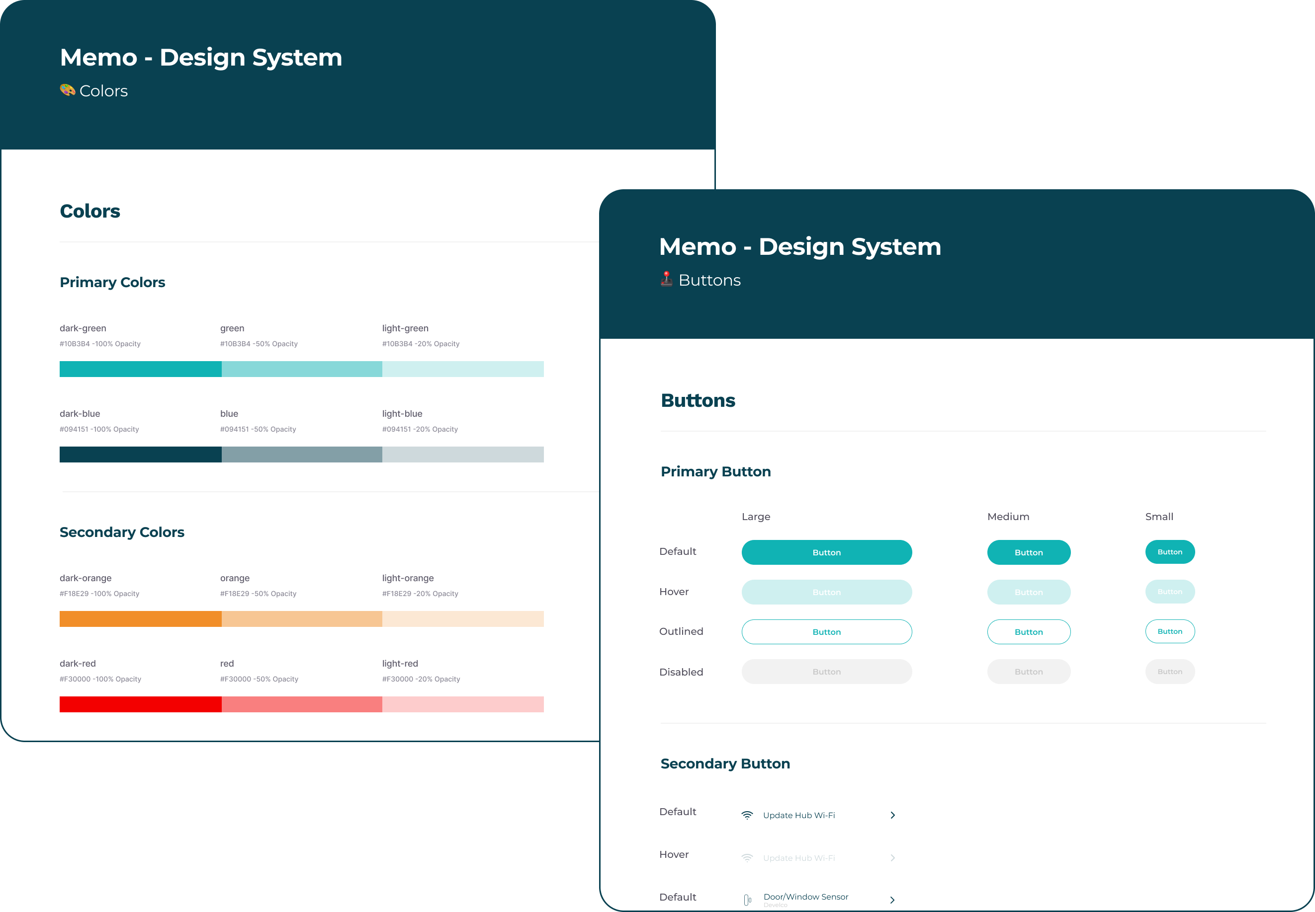
Design System
🎨 Create a Design System from scratch
As these products (mobile app and dashboard) were built by developers and I was the lead designer on the team - I had to create a design system from scratch as well as the icon library.
By doing so, I was making sure we could create consistency throughout the products making them all look like part of the same ecosystem.
Design
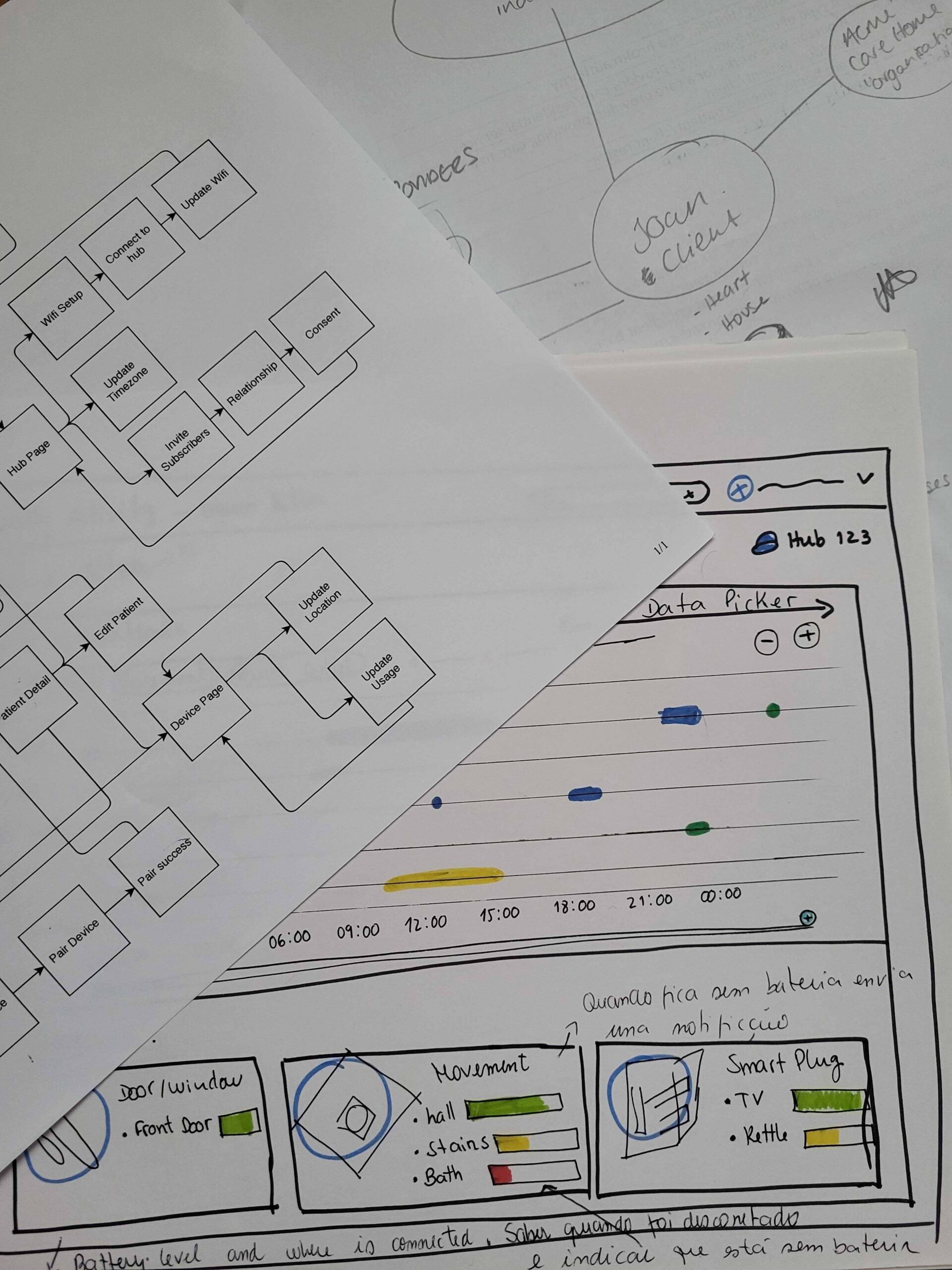
First explorations with pen and paper
👩🏻💻 Diverging and converging ideas
Based on the research, I've mapped the user flow to understand the dimension of the app and once established it was then time to jump into Figma and start to generate ideas - having a clear vision, well defined strategy, and a design system in place made it all easier to make this process.
This was a very iterative and colaborative process, I was constantly liaising with the mobile app developers as well as with the sales team to guarantee that the mobile app experience was meeting the user and business needs.
🚦 Challenges
One of the major challenges in this journey was that it was really hard to talk with the real users. I was told that at some point of the deveIopment I would be able to book a user testing lab and test the design with them but then.. the pandemic happened and it was no longer possible to do so.
To bypass this challenge, I would often make tests with peers from other startups in the building (that had never seen the mobile app before) to validate the design.
Iterations
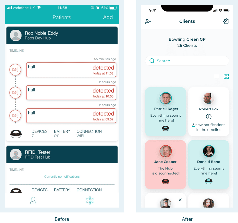
Create 2 types of users and organize the info
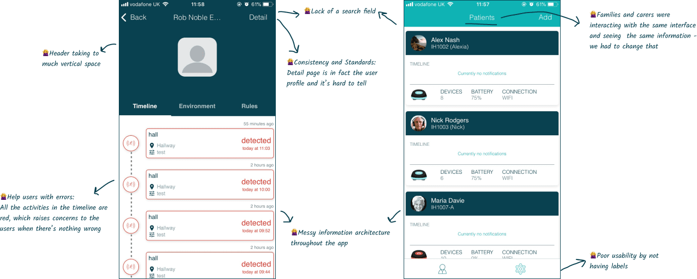
The app had 2 different roles - professional and individual user. However, the app didn’t devide the 2 profiles - so families and carers were seeing the same interface and information.
I worked on the information architecture of the app and created 2 different user flows for the different roles and organized information in a different way.
Another issue present was that the settings were all mixed (user, app and hardware) to address that, I've created different spaces for each one of the settings.
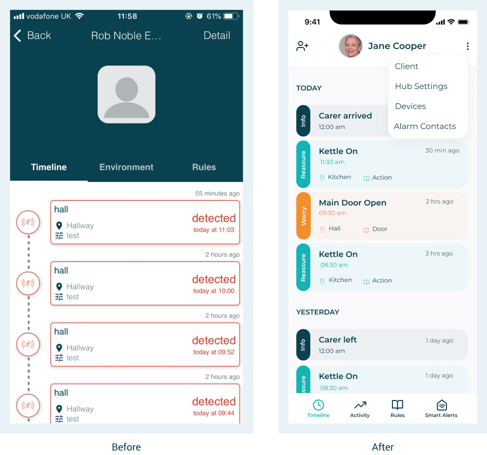
Improve navigation and give context
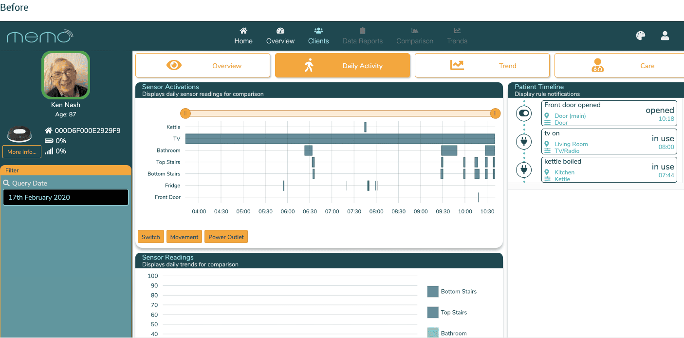
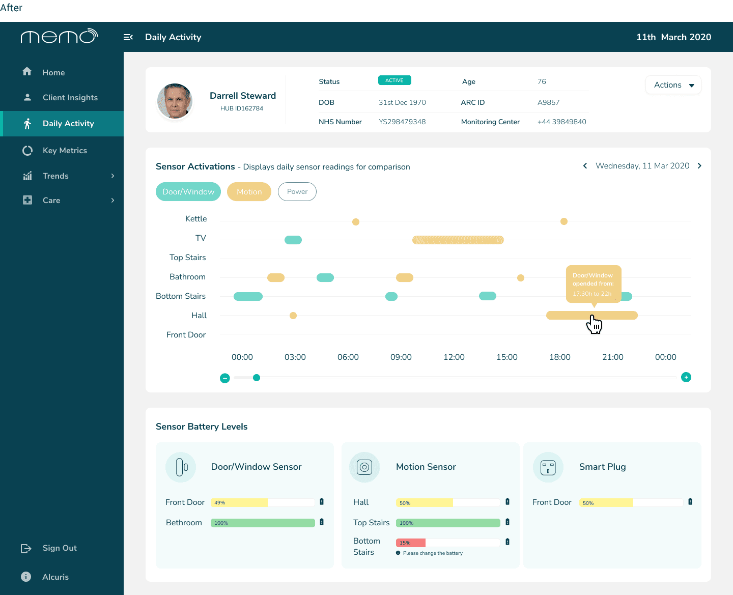
The timeline was passing a message that something was wrong all the time, which was not true. It also wasn’t giving a lot of context so I created different categories for the different outputs.
The timeline was also not displaying which rules were being activated.
The header was taking too much vertical space and the tabs were too far from the thumb zone, so I created the bottom menu to be easily reached and improved the labels to make it more intuitive.
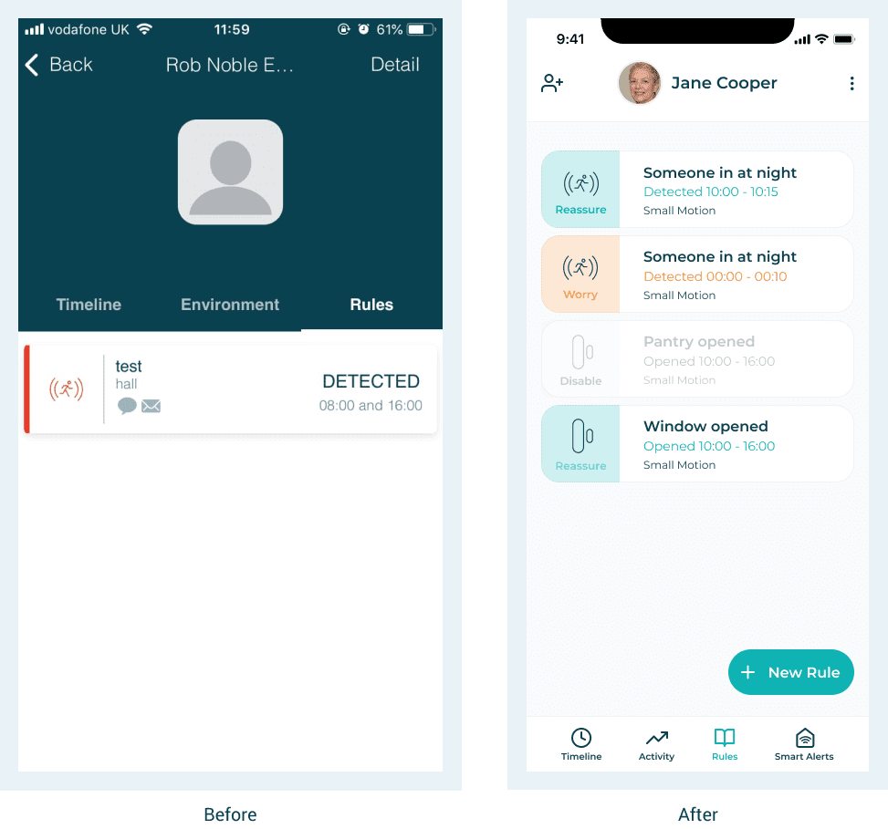
Give more context to the user
The list of rules had lack of context and the color coding was hinting warning alerts.
There was no way for the user to create new rules so I've added a "New Rule" button near the bottom nav to be easily reached .
In the dashboard I've implemented the same style, worked on the information architecture and improved the way information was being displayed.
LEARNINGS
& REFLECTIONS
🫶 Design with purpose
When I left Alcuris, I felt that the work I was doing was meaningful and that it could potentially help a lot of people:
- Patients that without this technology would not had the possiblitity of being independent and safe at the same time;
- Families that could be reassured that their loved ones were safe;
- Health care workers that could log data into the system and share it in real time with the families.
🤝 Work with a cross functional team
For me this was an amazing challenge both personally and professionally because it gave me the chance to work with various different roles and with the CEO directly - we brainstormed ideas and implemented them in a agile manner thus seeing the results really fast.
🎩 Juggled many different hats
Working in an early-stage startup is a big challenge. One needs to wear different hats and have the ability to adapt really quick to different scenarios and roles. This job gave me the possibility to grow so much as a professional and learn many different new skills in a fast-paced environment.
NEXT STEPS
If I had stayed at Alcuris, my next step would be to test the mobile app and dashboard with its real users and iterate from there.
As well as keep working on the dashboard experience because it would be a crucial tool for health institutions to track hundreds of patients in their houses instead of having them in the medical facilities.
NEXT PROJECT
|