Life Path
Mobile App that helps people to manage their own health records as well as their family members

Role
Product Designer
Timeline
Jun-Aug 2020
Life Path is part of my Design Master’s Thesis completed at the University of Aveiro, Portugal. The app allows the user to access and manage their own health records as well as their family members in an intuitive and comprehensive way.
Problem
In Portugal, all of the patient health records are kept on paper and can only be accessed by medical professionals. At the time there wasn’t a product on the market that addressed this issue. This creates a barrier in transparency and communication between healthcare professionals and the population.
Goals
💪🏻 To empower the general public in having easy and organized access to their own health records as well as their family members.
🗣 Encourage direct and simplified communication between health professionals and patients, raising awareness of a bidirectional system.
Solution
Design a mobile app that gathers all patient's records in a way that can be easily understood by the general public, regardless of age and background.
The Story
This is a funny one!
One summer I decided that I wanted to donate blood to help those in need. During my health assessment prior to my donation, the doctor asked for my blood type and as many of you can surely relate, I had no idea what it was! I intuitively reached out for my phone thinking that I must have this information stored somewhere… Surprise, surprise, I was wrong!! In that exact moment, just like an apple falling on Newton’s head, I decided what my project would be - Life Path.
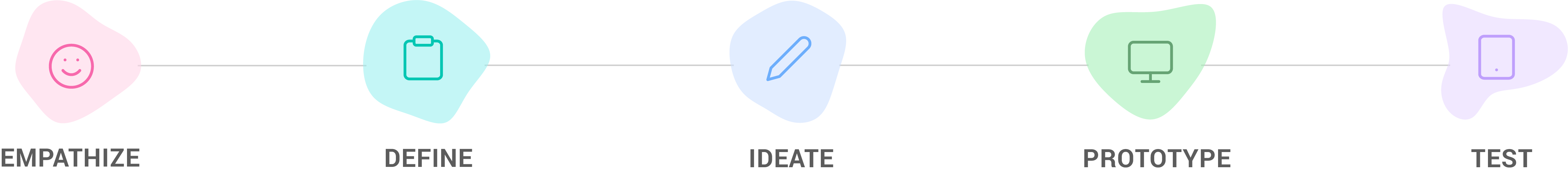
Process
When I started this project, I chose the Design Thinking process as my primary method because it is iterative, flexible, and focused on bringing ideas to life based on how real users think, feel and behave. With this process, I was able to understand the needs of the users, define the problem through a human-centric perspective, brainstorm different ideas in order to create a prototype, and test the solution.
User Research
💆🏻♀️ "Try to set aside your own assumptions, and focus solely on the users and their needs."
For a more holistic understanding of this matter, I spent a lot of time buried in the academic research and literature in order to have a better understanding of the problem, by the time that the research was complete a book came out of it!
Whilst researching, I also conducted an online survey and interviews. This survey had a total of 140 responses from people ranging between 18 and 50 years old. Through the survey, I was able to have a better understanding of their healthcare routine and needs, below are a few questions asked.
- Do you keep their your health records?
- What kind of mobile apps do you use to track your records?
- What kind of devices do you use to monitor your physical activity?
- Would you use a mobile app like Life Path?
- What kind of features you would like to see in a mobile app of this kind?
I also contacted my local GP and managed to arrange interviews with both doctors and nurses not only to validate the product but also to have an educated perspective and insights from real healthcare professionals.
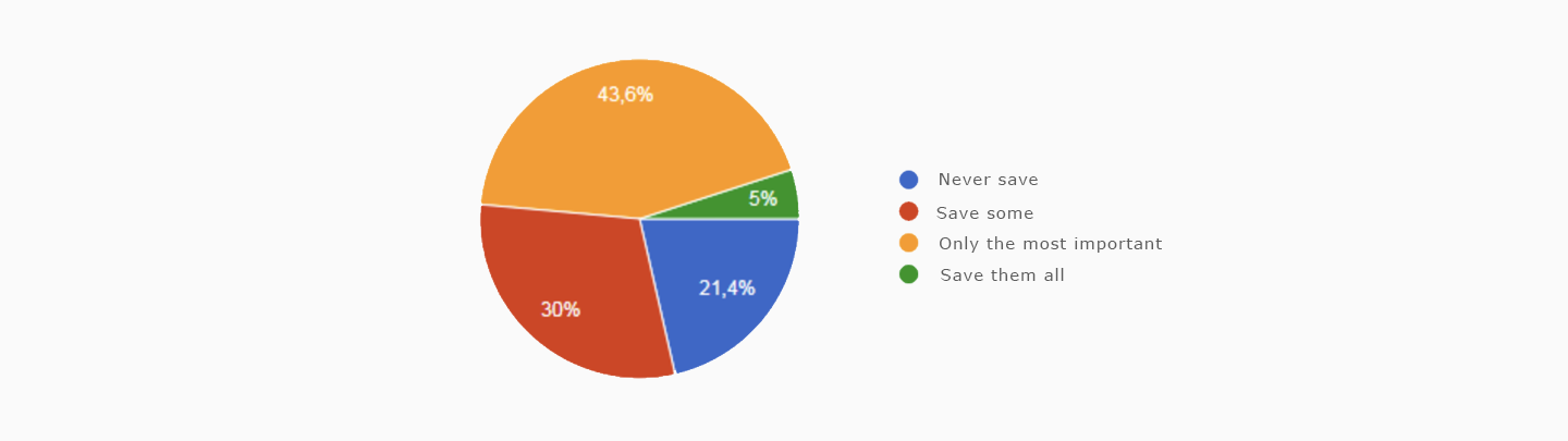
As we can see in the graph above, only 5% of the survey participants keep all of their own health records to hand.
Competitive Analysis
🕵🏻♀️ Let's see what is out there!
I analyzed existing platforms/apps, their features and potential design rationals. I also had to consider user feedback in order to understand what has been done and what is effective or futile.
For that I made a heuristic evaluation to discover new opportunities by analysing six mobile apps.
- iOS Halth
- myFitnessCompanion
- Pregnancy+
- Einstein Vaccines
- Runtastic
- MySNS
The mobile app that was the most relevant to Life Path was without a doubt MySNS. MySNS is a governmental app created with the intention of increasing proximity between the patient and healthcare professionals as well as improving the transparency of the services provided. However, the app was essentially a basic consultation app filled with government health recommendations. Having said that, I knew I would have an opportunity to make a difference and fill that gap with Life Path!
🚀 When creating Life Path my main goal was to develop it further than the existing MySNS by having a more complete and reliable product in which users could be more autonomous.
Research Analysis
📝 Gathering insights
After the user research was complete I moved into the analysis stage in which I turned all of the raw data into valuable insights by creating an affinity diagram.
ORGANIZE + DEFINE + CATEGORIZE + SYNTHESIZE = CONCRETE DATA
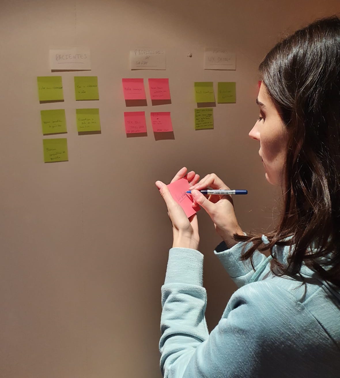
Creating an Affinity Diagram to find meaningful insights
✔️ Life Path Insights
- Patients want to be more informed and have more decision making power.
- The app needs to improve communication between patients and healthcare professionals.
- The app needs to be easy in accessing health record files as well as sharing them.
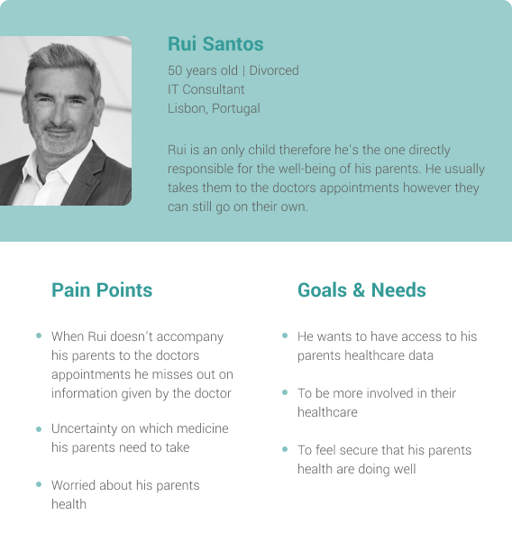
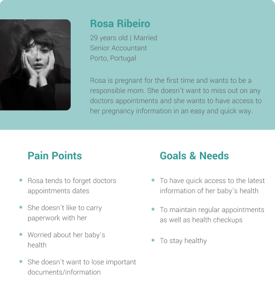
👫🏻 Personas - They make real users memorable
User personas are crucial to design something that is useful, desirable and valuable to my target audience. Based on my research I’ve identified a wide range of user types for Life Path: parents, pregnant women, adults with elderly parents, etc.
Ideation Phase
💡 Generating ideas...many many ideas
I started the ideation phase by brainstorming. This way I could generate as many ideas as possible without any restrictive fear of judgment.
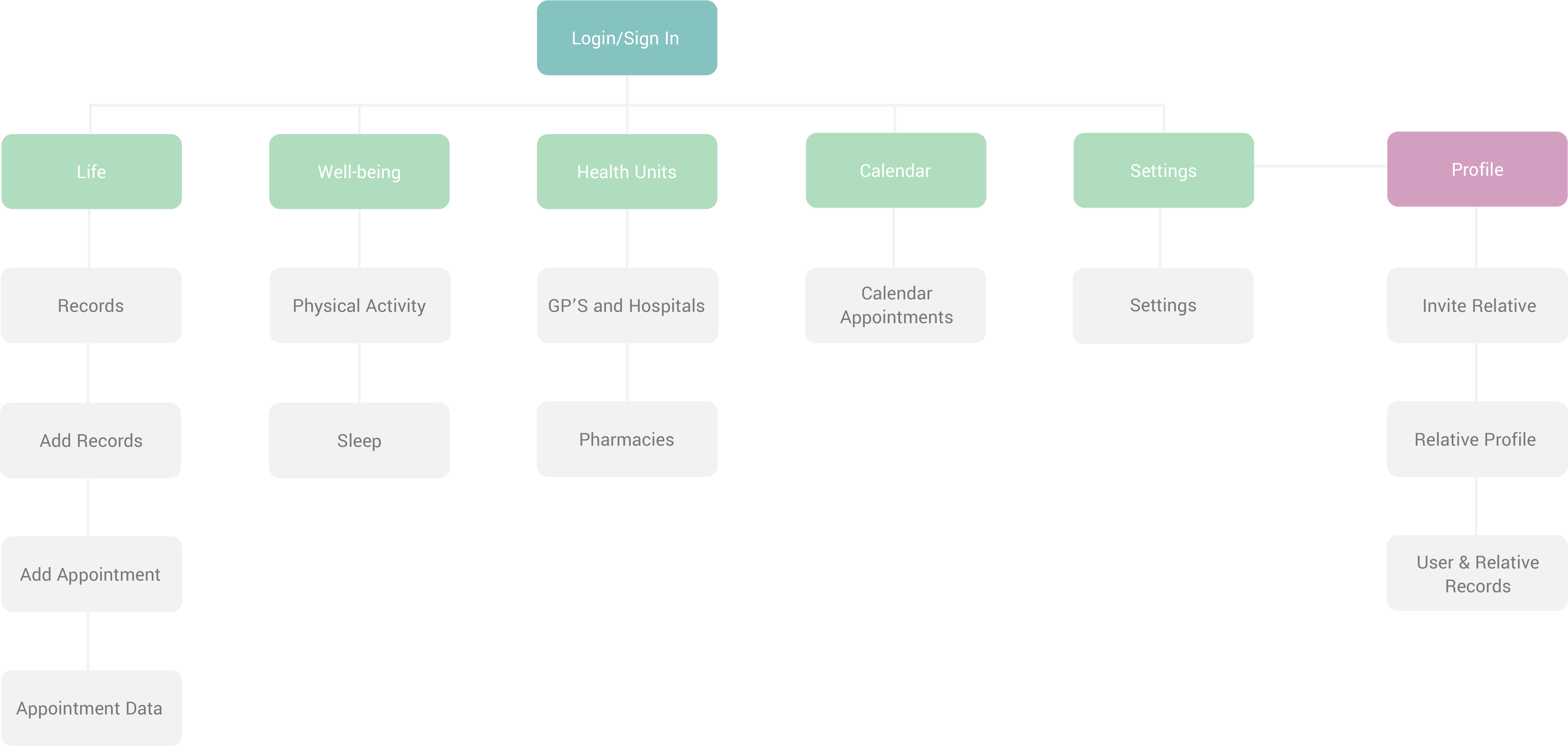
With all of the ideas in front of me the next step was to create a sitemap. This helped me to methodologically organize my content and navigation by giving a visual representation of the site’s organization and how different sections are linked together.
Prototype & Test
👩🏻💻 Diverging and converging ideas
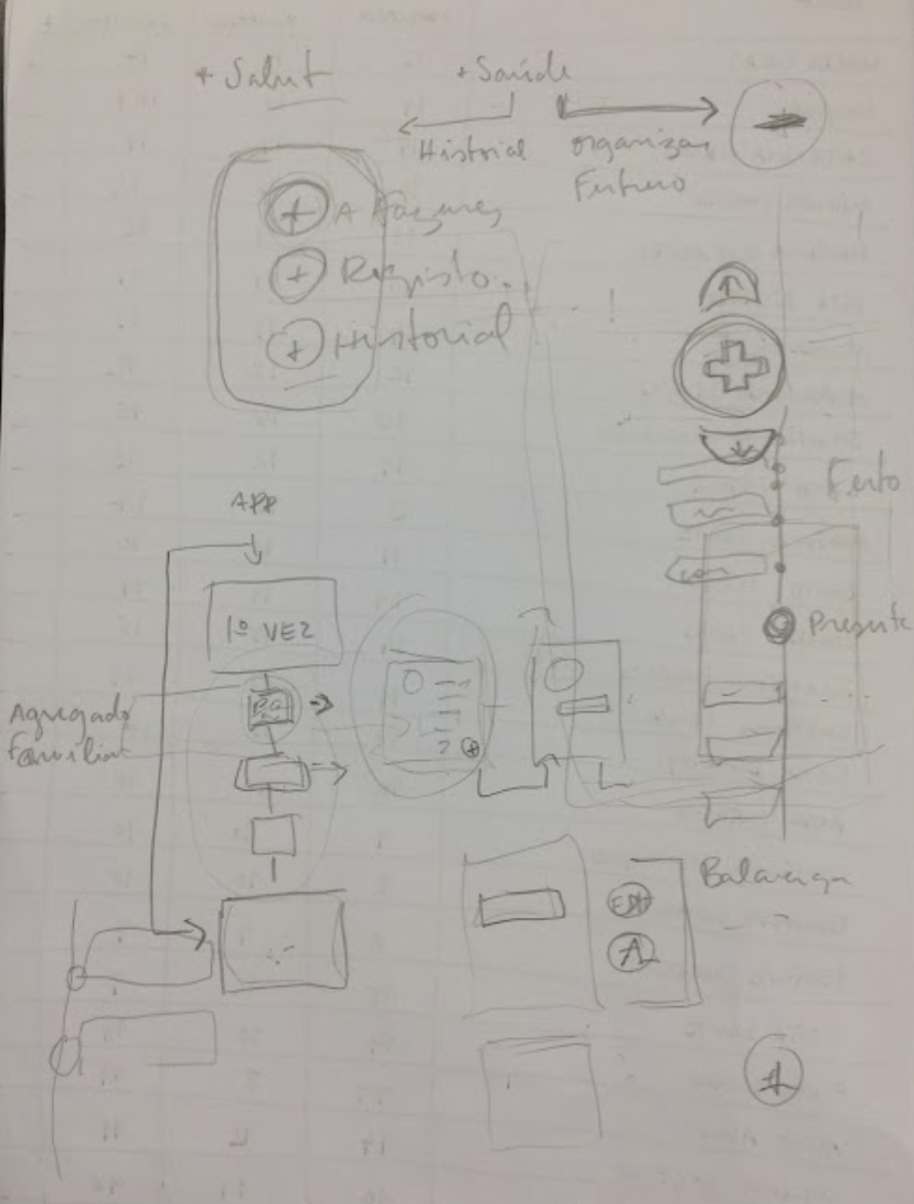
In order to understand how the user might navigate through the app I started to sketch on paper and made low fidelity wireframes. I’ve then made tests with users that were able to iterate rapidly as well as capable of identifying usability issues.
When the improvements of the low fidelity wireframes were completed and I was satisfied with the outcome, the next step was to create high fidelity wireframes and the prototype.
First drafts of Life Path
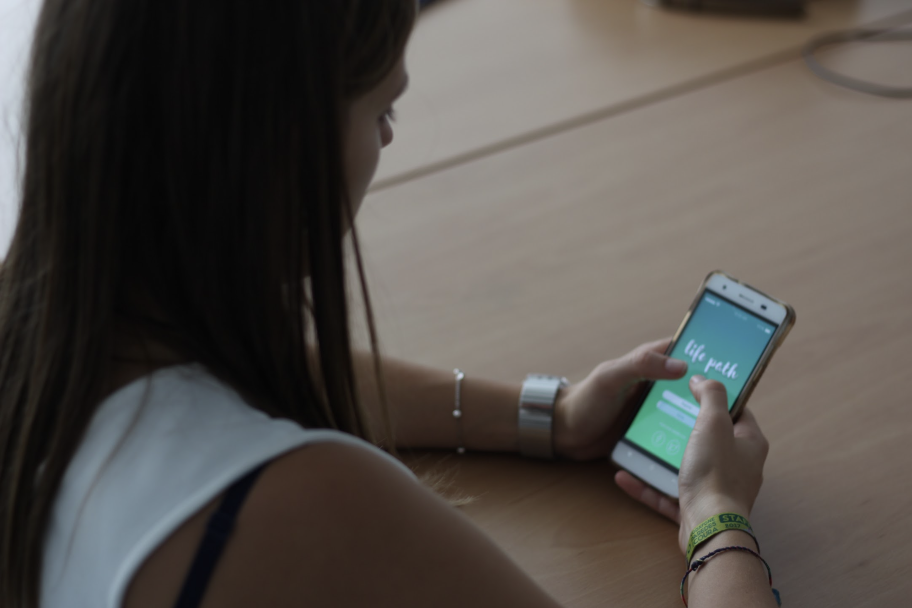
🤳🏻 Testing Life Path with users
In order to validate the product I conducted usability tests with 10 users from different backgrounds and age groups, .
A script was written and the participants were asked to perform a number of tasks so that all of the features of the prototype could be explored. I ensured that the script was broad enough to make sure that the participants would navigate through the main screens and the main functionalities of the app.
Through direct observation and thinking aloud protocol I was able to observe how the users interacted with the prototype whilst receiving “on the moment” feedback. This way I was able to identify any problems or constraints that they experienced with the interface and most importantly why those issues occurred, and how to prevent them from happening. Last but not least, the test was fundamental to evaluate the levels of satisfaction and frustration of the user.
User testing Life Path
Iterations & adjustments
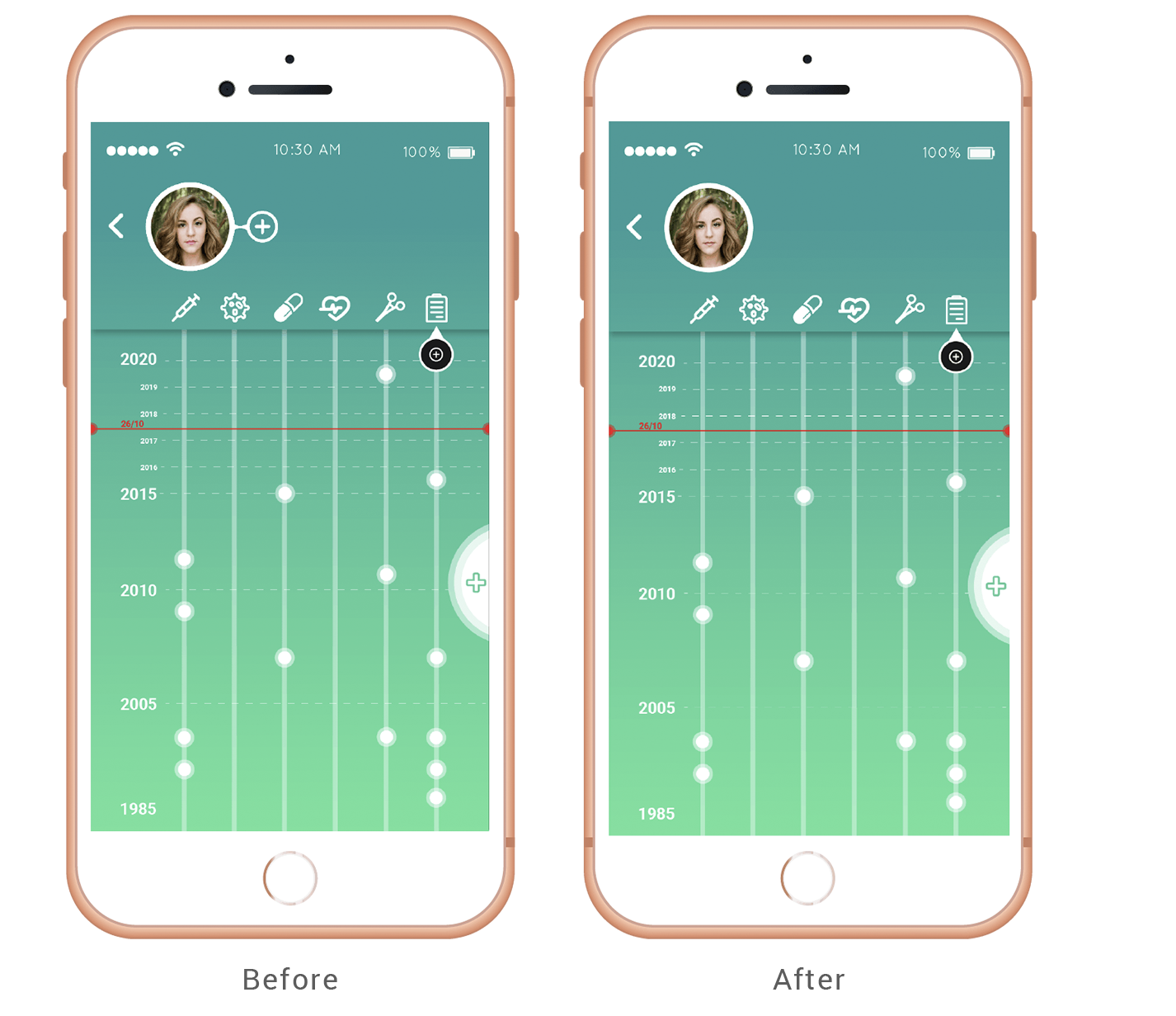
#1 - Add appointments
One of the tasks in the script that represented a constraint for the user was to add an appointment to the record.
In the first iteration, we can see two add buttons. One on the top left corner “add relative” and one on the right side of the screen “add appointment”. When asked to add an appointment a few users clicked the “add relative” button rather than the “add appointment” one.
Solution: Based on the feedback obtained by the test phase I decided to remove the “add relative” button from this particular screen and moved it to the profile screen.
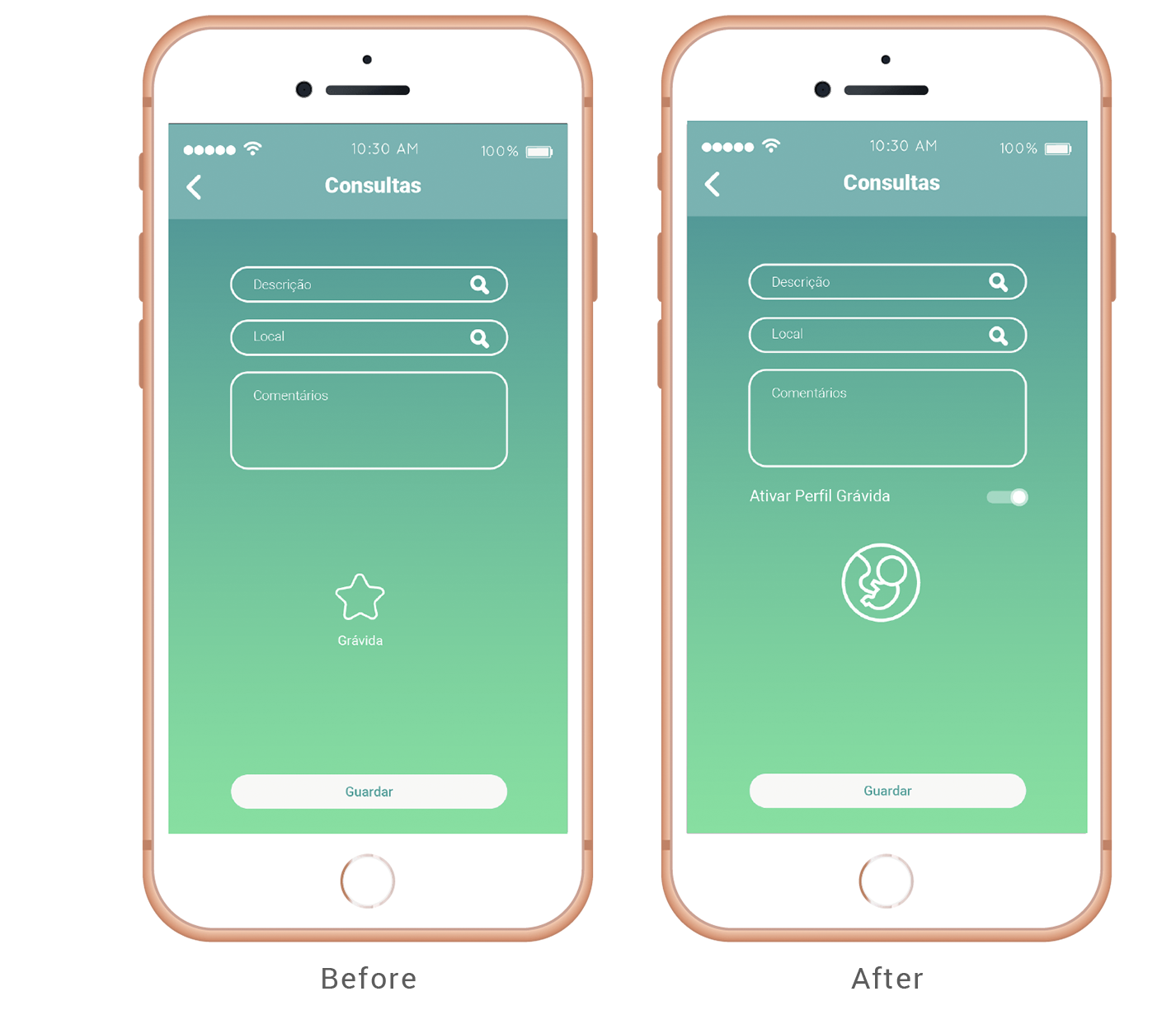
#2 - Add pregnancy appointment
Another task that could be found on the script was to activate the pregnant profile when adding an appointment. Most of the users reported that the first iteration was not intuitive enough and this caused a constraint when trying to book an appointment for a pregnant woman.
Solution: To improve the user experience I followed the Usability Heuristics For User Interface Design where the main dogma is: Recognition Rather than Recall. Therefore I’ve replaced the star icon with a fetus as well as adding a toggle switch to activate the pregnant profile.
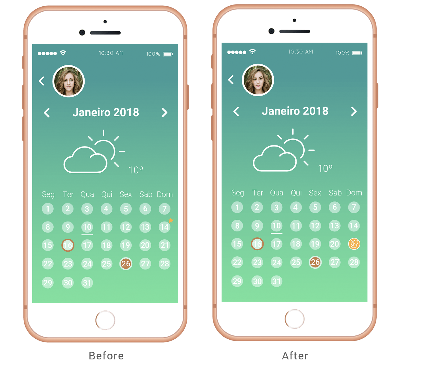
#3 - Identify pregnancy appointment
Following the issue encountered on point number 2 where the testers had difficulties adding a pregnancy appointment due to the non-intuitive icon of a star, the same constraint was happening on identifying in the calendar the pregnancy appointment.
Solution: Replacement of the star icon with a fetus icon in order to be more intuitive to the user.
Final Screens

LEARNINGS
& REFLETIONS
💪🏻 Design can be a powerful tool in the healthcare field
For years the communication issues in the healthcare system have been present and not addressed properly. Private and public health organizations need to understand what an ally UX and UI design can be in creating a stronger and simplistic link between patients and health professionals.
🧏🏻♀️ Always confirm your assumptions
I started this project with a strong belief that a product like this could be helpful for the general population. Nevertheless, I had to run surveys to confirm my assumptions as it was imperative to make sure I was making a product with value. User demand is the most important element to have in consideration before conducting a project. What I find useful may not be useful to the market. Having said that, market research must be done at the earliest stage possible.
CONCLUSION
Throughout the duration of this project my levels of dedication and enthusiasm were always at the highest levels of standards, not because this was my Master’s Thesis, which on itself already requires all of my fully and devoted dedication, but because this was an idea that I strongly believe that can make a difference by improving the already existing healthcare services and institutions.
In sum, it’s clear the impact that Design can have in our modern world and as a UX/UI Designer I feel that projects like Life Path should be more recurrent because in my view, there’s a lot of growing margin in this area and all the designers should work together to make healthcare more accessible and easy to understand for everyone.
Update: Covid came to reinforce that this project was a good idea and woth that push, this field became more important.
NEXT PROJECT
|